How accurate are pre-election polls in Namibia?
November 6, 2024
The Namibian national elections are three weeks from today, and we have very little idea of what’s going to happen. I’m writing the day after the U.S. election, in a year where more than 12,000(!) polls asked Americans about their choice for president.1
Namibia is near the other end of the spectrum when it comes to pre-election polling. There’s really only one credible survey on politics in Namibia, and that’s the Afrobarometer. Every few years they ask a random sample of Namibians over 100 questions on a variety of social issues — and one of them happens to ask them which party they would support in an election.
Is this measure good at predicting actual results? To check, I gathered the Afrobarometer survey results closest to the last three elections (2009, 2014, 2019), and compared them to results from the National Assembly elections.
Why National Assembly and not Presidential Elections? And other measurement issues.
Measuring the accuracy of the polls is made difficult by the fact that the survey questions change over time, and don’t neatly correspond to a particular election. A decade ago, Afrobarometer asked which party’s candidate people would vote for in a presidential election. Now it’s about which candidate’s party they would vote for in a national election
| Election | Survey Date | Question |
|---|---|---|
| 2009 | Oct-Dec 2008 | If a presidential election were held tomorrow, which party’s candidate would you vote for? |
| 2014 | Aug-Sep 2014 | If a presidential election were held tomorrow, which party’s candidate would you vote for? |
| 2019 | Aug 2019 | If National elections were held tomorrow, which [party’s candidate] would you vote for? |
| 2024 | Mar-Apr 2024 | If national elections were held tomorrow, which candidate’s party would you vote for? |
The questions in 2009 and 2014 ask about the presidential election — but the response options are parties, not candidates. But these cannot correspond well to the outcome, because in the actual presidential elections:
many parties don’t field a candidate, and their supporters then have to pick someone from another party, even if they would prefer their own party’s candidate.
there are now independent candidates, who aren’t asked about in the survey.
So presidential results are an awkward comparison for the data the survey actually gathered.
I think it’s best (and probably in line with the survey’s intentions) to treat the survey questions as a broad measure of party support in the next election, and so the National Assembly elections make sense as a point of comparison. Still, looking at data across a time period where the measure changes is always tricky, and we need to take a large grain of salt when interpreting findings.
The other decision I had to make was about how to calculate the percentages for each party in the survey. Right now, I use the raw percentage: if 60 out of 1200 respondents say they will vote CoD, I report that as 5 percent. There is another option: I could exclude any combination of people who don’t know whom they’ll vote for, who refused to answer, or won’t vote. So for example I could say: while there are 1200 respondents, 300 say they won’t vote, leaving a total of 900. 60 of those respondents picked CoD, giving them a percentage of \(\frac{60}{900}\approx6.67\). (These numbers are made up for illustrative purposes. I could do similar calculations, like ‘percentage of people who have picked a party’, etc). Often, excluding some categories makes the Afrobarometer look even better. For a variety of reasons, I chose the simple way of doing it — above all because these are the topline figures that have been reported this year, and I want to make it easy to check my figures against the official releases.
Finally, a quick caveat: I’m working with three surveys here. This is very little data; just one weird one can throw off our view of things. Again, let’s proceed with caution.
Here are the results at a glance:
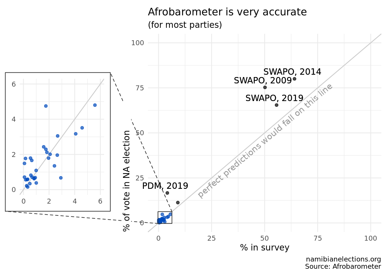
The above graph indicates how accurate pre-election Afrobarometer polls have been in Namibia. Each dot represents one party, in one given election. Its position on the x-axis tells us what percent of people said they would vote for the party’s candidate in the upcoming election, and the position on the y-axis shows how much the party actually won in the National Assembly Election that year. If a party does exactly as well in the election as predicted by the survey, it falls on the grey diagonal line.
If you want to take a detailed look, the below tables show, for the last three elections, what percentage parties got in the Afrobarometer, and the parties’ actual performance in the National Assembly election.
| Party | Survey | Election |
|---|---|---|
| APP | 2.42 | 1.35 |
| COD | 2.92 | 0.67 |
| PDM/DTA | 4.08 | 3.17 |
| MAG | 0.33 | 0.59 |
| NDMC | 0.25 | 0.22 |
| NDP | 0.33 | 0.15 |
| NUDO | 2.67 | 3.05 |
| RDP | 9.08 | 11.31 |
| RP | 0.58 | 0.82 |
| SWANU | 0.83 | 0.62 |
| SWAPO | 50.17 | 75.27 |
| UDF | 1.58 | 2.43 |
| CP | NA | 0.10 |
| DPN | NA | 0.24 |
| Don’t know | 7.25 | NA |
| Would not vote | 7.08 | NA |
| Refused to answer | 10.42 | NA |
| Party | Survey | Election |
|---|---|---|
| APP | 1.75 | 2.29 |
| COD | 1.00 | 0.38 |
| WRP | 0.08 | 1.49 |
| MAG | 0.50 | 0.34 |
| NDPD | 0.08 | NA |
| NUDO | 2.08 | 2.01 |
| PDM/DTA | 5.58 | 4.80 |
| RDP | 4.58 | 3.51 |
| RP | 0.92 | 0.68 |
| SWANU | 0.67 | 0.71 |
| SWAPO | 64.08 | 80.01 |
| UDF | 1.83 | 2.12 |
| UPM | 0.08 | 0.71 |
| CDV | NA | 0.29 |
| DPN | NA | 0.13 |
| NDP | NA | 0.16 |
| NEFF | NA | 0.36 |
| Don’t know | 2.33 | NA |
| Would not vote | 3.83 | NA |
| Refused to answer | 10.17 | NA |
| Party | Survey | Election |
|---|---|---|
| APP | 0.55 | 1.79 |
| COD | 0.29 | 0.57 |
| DPN | 0.08 | NA |
| LPM | 1.75 | 4.75 |
| NDP | 0.18 | 0.56 |
| NEFF | 0.65 | 1.66 |
| NUDO | 2.64 | 1.96 |
| PDM/DTA | 4.13 | 16.65 |
| RDP | 0.99 | 1.09 |
| RP | 0.16 | 1.77 |
| SWANU | 0.83 | 0.65 |
| SWAPO | 55.63 | 65.45 |
| UDF | 1.96 | 1.79 |
| UPM | 0.09 | NA |
| CDV | NA | 0.71 |
| NPF | NA | 0.22 |
| WRP | NA | 0.39 |
| Don’t know | 3.46 | NA |
| Would not vote | 12.95 | NA |
| Refused to answer | 13.25 | NA |
| Party | Survey | Election |
|---|---|---|
| APP | 0.6 | 0.66 |
| COD | 0.3 | 0.16 |
| DPN | 0.1 | NA |
| MAG | 0.1 | NA |
| NEFF | 2.3 | 1.07 |
| NUDO | 3.1 | 0.98 |
| RDP | 0.8 | 0.30 |
| SWANU | 0.4 | 1.05 |
| SWAPO | 50.8 | 53.38 |
| UDF | 1.2 | 1.54 |
| UPM | 0.2 | 0.20 |
| LPM | 5.6 | 5.21 |
| PDM | 4.9 | 5.48 |
| IPC | 5.0 | 20.21 |
| NPF | 0.3 | 0.12 |
| BCP | 0.1 | 0.53 |
| AR | 0.7 | 6.61 |
| Don’t know | 6.9 | NA |
| Would not vote | 7.4 | NA |
| Refused to answer | 9.2 | NA |
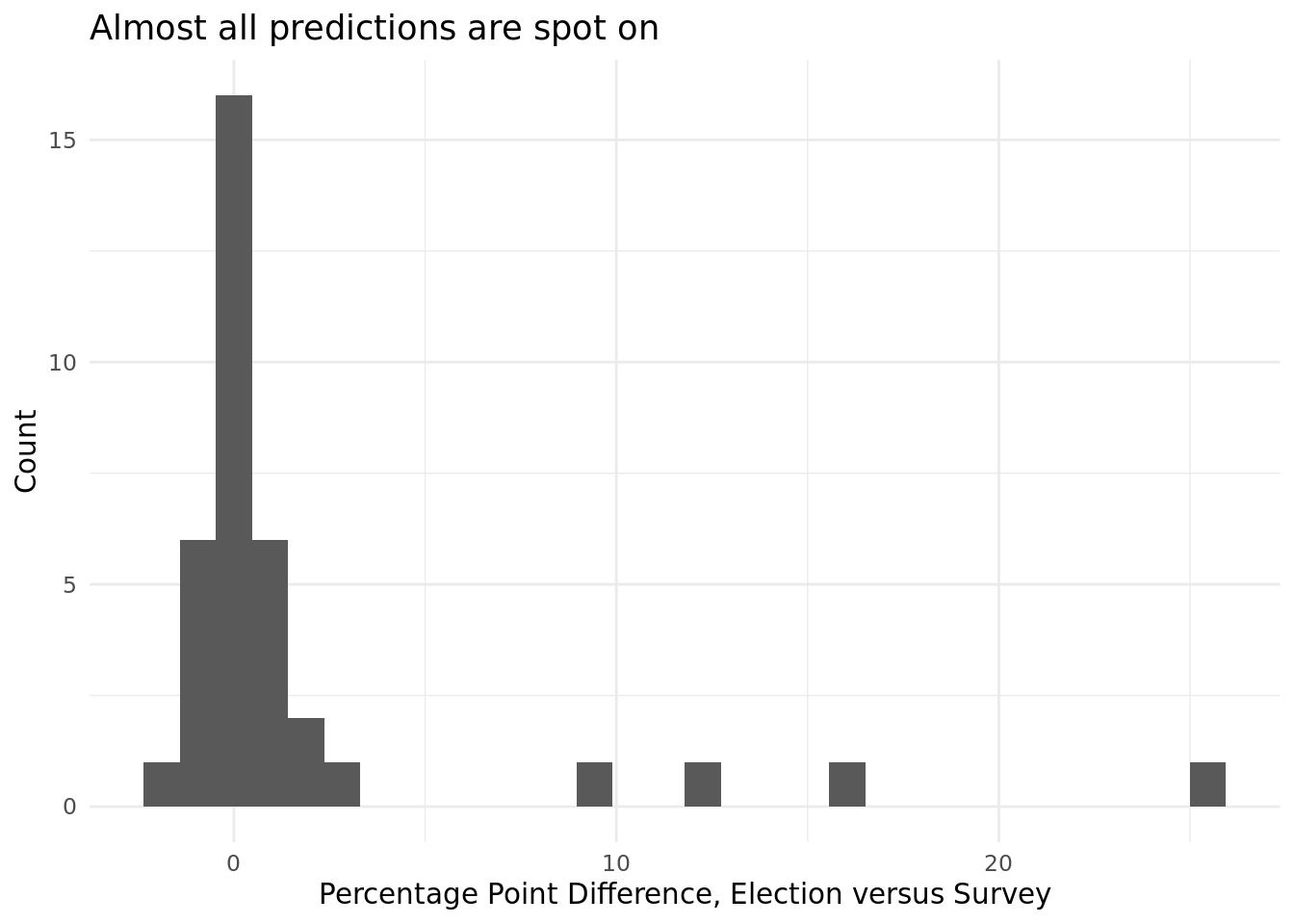
The tables give more detail to what we could see on the graph above: most of the time, for most parties, the Afrobarometer predicts election performance rather well.2
Searchable Table: predictions, results, differences, all years
SWAPO’s Overperformance
The one thing that immediately stands out in both graph and tables is that the surveys consistently underestimate SWAPO. Take 2009: only 50% of survey respondents indicated a preference for SWAPO, but 75% of people voted for them. What happened?
It seems that a lot of this difference is due to three types of people: those who told the surveyors that they would not vote, that they did not know whom they would vote for, or simply refused to answer. Depending on the year, between 16% and 30% of the electorate falls in one of these categories. I’ll call them ‘shy voters’ — some might already have a choice, other not; but either way they don’t want to tell a surveyor.
The data we have doesn’t tell us why these respondents answer this way and then vote for SWAPO anyway, but I think a plausible story looks something like this. Going a while back now, there are some people who are committed to SWAPO, and a big chunk of the electorate who are not. Many of that group of people do end up in a polling station, and when time comes to pick a party, they go with what seems like the default — the incumbent. This seems to have happened in 2009 and 2014, where SWAPO’s overperformance is very close to the size of that bloc of shy voters. (see the two tables below).
This year, 50% of people said they would vote for SWAPO. Does that mean the party will get 75% again, like they did in 2009? I suspect not, because things have changed in recent years. First, note that SWAPO’s overperformance has been decreasing over time:
| Year | Survey | Election | SWAPO Overperformance |
|---|---|---|---|
| 2009 | 50.17 | 75.27 | 25.1 |
| 2014 | 64.08 | 80.01 | 15.93 |
| 2019 | 55.63 | 65.45 | 9.82 |
| 2024 | 50.80 | 53.38 | 2.58 |
This is not because people are becoming more decisive or opinionated, because the pool of shy voters is not shrinking with time:
| Year | Don’t Know + Won’t Vote + Refused to Answer |
|---|---|
| 2009 | 24.75 |
| 2014 | 16.33 |
| 2019 | 29.66 |
| 2024 | 23.50 |
But in recent years, maybe some of these voters have been put off by various issues. When they see an opposition party they like, they might jump on the bandwagon, rather than sticking with the incumbent — this may have happened with PDM in 2019, who got 12% more than the polls suggested. In fact, that year most opposition parties did better in the election than the polls, some significantly so.
In short, If an opposition party can make itself seem like a legitimate alternative, it can benefit on election day — even if their core support remains small. This means the polls might be off for a number of parties this year. Several opposition parties have robust campaigns, and all of them could benefit from late deciders.
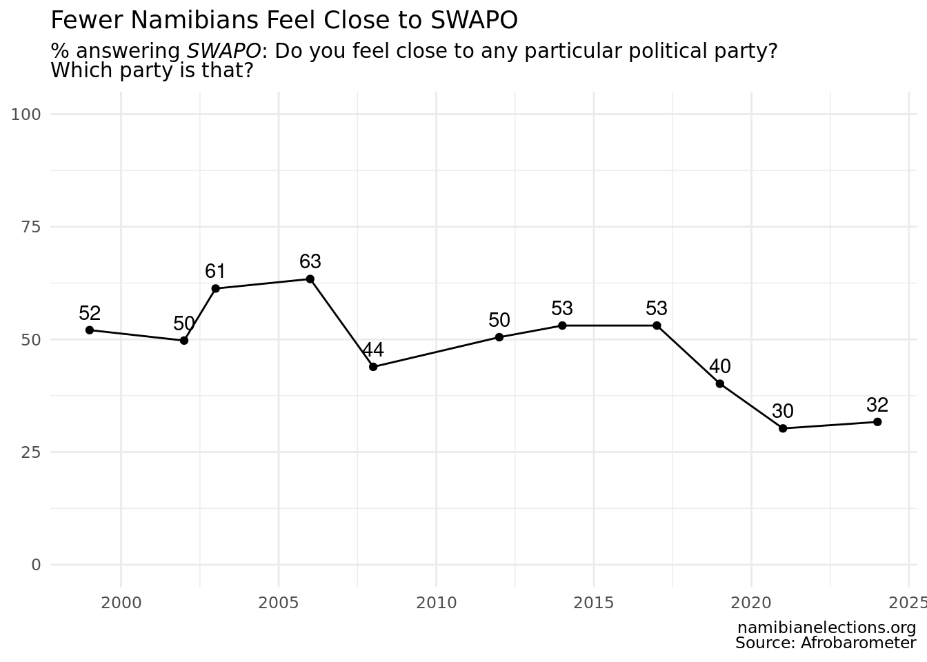
Another piece of evidence is SWAPO’s decreasing number of partisans. Ever since the beginning, Afrobarometer has asked Namibians whether they feel close to any particular party. Let’s take that as an indicator of strong partisanship. SWAPO has always done much better than other parties here, but they have seen a decline in support. While half of Namibians felt close to the party at the turn of the century, in recent surveys that number is down to roughly a third.

The Bottom Line
The politicians who complained so bitterly about Afrobarometer’s numbers should allow themselves to feel a little bit of optimism. Until now, the poll has mostly been correct — and if not, often parties did better than in the poll. The significant proportion of voters who do not express a choice suggest that, on election day, there are a lot of votes up for grabs that aren’t captured by the survey. For many parties, it makes sense to see the poll as a floor, not a ceiling. Just how much higher they can go remains to be seen.
Bonus Graph

Footnotes
I got that number by downloading a spreadsheet of presidential polls from FiveThirtyEight, who kindly collect and share that data: https://projects.fivethirtyeight.com/polls/president-general/2024/national/↩︎
Remember also that this survey, like any survey, inherently has some uncertainty — in this case a 3% margin of error.↩︎